
After my first self-portrait (last post on this blog), I ended up doing an art challenge of doing one self-portrait per day. Each of these self-portraits were created in the painting simulator 'Fresh Paint' on my Microsoft Surface tablet, and drawn with a stylus.
Saturday 23rd April

This is the first picture and the one that started it all. It's got its own blog entry (the previous one to this). I was just getting used to the stylus, so it is not as neat as it could be. The nose is a bit flattened at the the bottom, and this is the first picture where I noticed that I was struggling to draw noses.
I was aiming for dramatic lighting with dark blue/purple shadows, but I think I was a little zealous with the lilacs and lavenders in this, making me look a little alien-purple over all. I spent the rest of the series trying to alter that balance to something I liked. The emerald green hair came out really well, especially the contrasts and shadows in it, and I am also really happy with the shimmer effect on the sparkly/iridescent lipgloss (over black lipstick).

I really like how this one looks like it's almost from an old horror-movie poster, back when they were done with paintings, rather than digital collages of footage from the film/photographs taken for promotional pictures and then digitally manipulated. I feel like I belong in a b-movie about witches or vampires in this picture, which to me, is just perfect. There's something about an artist's interpretation of a film that always adds something special - art interpreting art.
The circlet I am wearing is hand-made, and bought from Far Fetched in Inverness. I think it's made by a local woman, but I'm not entirely sure - I will find out more when I am next in that shop. I was told when I bought the circlet, but I have since forgotten. It was picked on account of looking very elfin - a mixture of Art Nouveau and Celtic swirls. Raven's been inspired by the whole circlet thing, and wants to start making his own designs - I've also been doing sketches of my own designs for circlets, so perhaps there will be more of those in future.
The pentacle-and-moon necklace was from Claire's Accessories of all places - I guess this awful 'trend' based off occult imagery is useful for something, even if as an actual witch I take issue with turning my symbols into a commercialised meaningless trend, and it being used to signify a sort of hollow 'edginess'. In retrospect, buying something from a retailer that is part of that commercialisation, even if I am going to wear that necklace as an un-ironic, un-pretentious and authentic reflection of my faith and spirituality, as each sale just feeds the capitalist machine.
Artistically, there's a few errors of proportion in this - the cheek-bone on the right isn't quite the right shape, and my nose is not the best rendition thereof. It's the bottom of the nose, around the bulb and nostrils, that I struggle with most. I have been paying close attention to how I do my nose in the subsequent pictures as I've realised that noses are something I really struggle with. The shading on the neck is a bit on the 'sharp'. I am happy with how the hair turned out, however, and think that the brighter streak in my hair (Crazy Colour Emerald Green comes out apple green, and the rest of my hair is Directions Apple Green, which comes out emerald green... go figure!) worked really well in this particular rendition.
Monday 25th April

Artistically, I think this was probably the least successful. The proportions of my face are wrong - especially the cheeks looking too puffy, and the nose being at an odd angle. Again, I struggled with the nostrils and the bulb of the nose.
The hair turned out pretty well, although trying to get all the flicks and swirls would have possibly been more effective with a finer bush - I was using the finest brush size available on Fresh Paint, however. I also like how painterly the colours are on this - they seem quite alive and vibrant, and the picture, while probably not the most accurate likeness of me in terms of actually looking like my face, probably captures the most energy. There's also something a bit fey, pixie-like about it, which I rather like.
The hair turned out pretty well, although trying to get all the flicks and swirls would have possibly been more effective with a finer bush - I was using the finest brush size available on Fresh Paint, however. I also like how painterly the colours are on this - they seem quite alive and vibrant, and the picture, while probably not the most accurate likeness of me in terms of actually looking like my face, probably captures the most energy. There's also something a bit fey, pixie-like about it, which I rather like.

I have 'resting bitch face' in this picture. I look a mixture of imperious and angry, and a little bit derisive. That wasn't intentional, more the result of actually looking crabby because I was having a bad day, and few errors of artistry that have come together to make me look even more foul-tempered. I think it's a very severe line of the mouth that's the greatest culprit in this for my expression.
The nose is a little off straight, but my nose actually IS a bit bent as it was broken when I was a child. I think however that I made it a little wonkier than it actually is - perhaps subconsciously done, as I'm quite self-conscious about it. I am happy with how the green shimmer came out on the lipstick - I am wearing the green iridescent lipgloss again, but this time over 'Blackberry Fool' lipstick from the Collection 'Lasting Colour' range.
Angry expression aside, this is probably my favourite picture of the lot. Actually, maybe the angry expression contributes, but the angle of the pose, the framing of my hair, and the solidity I have given my face all seem quite stately and powerful here. The angry and slightly imperious expression probably contribute to that in a "do not meddle with the affairs of dragons, for you are crunch and taste good with sauce" sort of way :P (Although I'm sure I'm some sort of harpy rather than a dragon! )
Wednesday 27th April

In general, I find this one a bit "meh". Artistically, I've got the blending down a lot better than in the previous pictures, but there's something lifeless about it, a little anodyne and unremarkable. I guess the uninteresting make-up doesn't help; simple black eye-shadow and eye-liner, and simple purple lips. The expression is a the sort of smile one does for photographs that doesn't quite seem genuine and doesn't quite seem false, and this picture does not have the contrast or dynamic angles of some of the others.
The hair is also the wrong colour - my hair is emerald green, for the most part, and in this it seems too grass-green. Certainly the colours over all seem warmer, but even with this considered the hair seems too yellow-green.
This is probably the best nose so far, and I think all the care and attention I have put into doing the noses over the course of the week has been paying off and there has been an improvement with each new picture.
Thursday 28th April
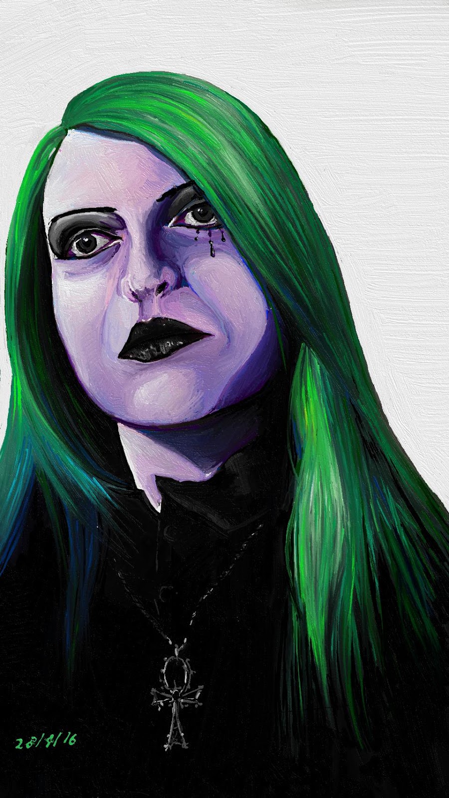
The eye makeup on this one is something I wore a few weeks back when I got my new curly dark green wig. I felt like making a reprise with it for this self-portrait.
I think with each iteration of the challenge, the images become a closer and closer likeness of me. This one seems a little squiff, however. I drew it in more than one sitting, and I think the nose and mouth are slightly out of align with the rest of the face and the eyes. I am still struggling to paint good noses, but they are improving - even if this one is perhaps a bit out of align.
The necklace is an ankh in the Gothic architectural style. I love the mixture of influences in this necklace. It's one of my collection of Alchemy Gothic jewellery. I've slowly been accumulating a collection of all the jewellery I wanted in the early '00s but was neither allowed to buy nor had the money for. 15 years later I am finally getting my talons on them! This ankh is probably my favourite necklace at the moment in terms of design. !
I was attempting to do something interesting with the contrast, and with negative space in both terms of black and white negative space. I'm not sure if the composition really worked out, with the detailed parts being on the diagonal between the block of white and block of black, but that's what the intention was.
Friday 29th April

Last, but not least, a portrait trying to show the blues and purples still in my hair. For the most part, my hair is now emerald green, but previously, as frequent readers will know, my hair was half a rainbow of colours, and it was quite difficult to get some of the colours out, and some parts were therefore re-coloured as accents, meaning that while my hair is predominantly green, there are a few flashes of blue and purple in it. These are mostly in the under-layers, so for this picture I deliberately styles my hair so a few strands of those colours would come to the fore. Flashes of blue near the bottom have been visible in previous self-portraits, but this is the first where it is clear that these are indeed accents in my hair, and not just a trick of lighting.
I still haven't figured out how to get my noses correct and consistent, but I do think there has been an overall improvement in them over the course of the week. I guess the more I practice, the more I will learn.
The choker/necklace is another Alchemy Gothic piece - in this case a hinged choker with bat-wings, skulls and cross-bones and Gothic tracery. I really like the Alchemy designs that incorporate elements of the Gothic architectural style.
Make-up is more of my favourite swirlies and purple lipstick. The swirls in this one are both regular black liquid eye-liner, and silver eye-liner. It is a lot easier to draw the swirls on the flatness of a painting than on the curves of my face, that is for sure!
~✵✯✩*⭒*✩✯✵~
This week's self-portrait challenge has been challenging indeed, and hopefully it has taught me a few things - not just about FreshPaint and digital painting, but about portraiture in general. Practice makes improvement, especially if that practice is challenging and pushes me into trying things I don't often do, and which need improvement. I know I am not so good at noses, and so I will continue to work on improving those in my art. I would love to hear what you think of the pictures - constructive criticisms included. I can only improve if I know where I am going wrong!
