My personal blog as a 'grown-up' Goth and Romantic living in the Highlands of Scotland. I write about the places I go, the things I see and my thoughts on life as a Goth and the subculture, and things in the broader realm of the Gothic and darkly Romantic. Sometimes I write about music I like and sometimes I review things. This blog often includes architectural photography, graveyards and other images from the darker side of life.

Goth is not just about imitating each other, it is a creative movement and subculture that grew out of post-punk and is based on seeing beauty in the dark places of the world, the expression of that in Goth rock. It looks back to the various ways throughout history in which people have confronted and explored the macabre, the dark and the taboo, and as such I'm going to post about more than the just the standards of the subculture (Siouxsie, Sisters of Mercy, Bauhaus, et al) and look at things by people who might not consider themselves anything to do with the subculture, but have eyes for the dark places. The Gothic should not be limited by what is already within it; inspiration comes from all places, the key is to look with open eyes, listen carefully and think with an open mind..

Showing posts with label colour. Show all posts

Friday, 28 August 2020

Romantic Goth: My first love in Goth style

Aesthetically, Romantic Goth is my first and most constant love. Yes, my hair is a fantastical set of neon colours, but they owe more to the myth of mermaids drowning sailors than to the CyberGoth hybrid subculture - although I like that sort of more danceable industrial too! 

A woman with neon-green to royal blue gradient hair, neon green at the top, fading through emerald green and aqua to the deep blues of the ocean. She has pale skin, and dramatic make-up. She is wearing eyeshadow in neon green, emerald green and bright blue, with metalic violet and black eyeliner in a 'winged' style, and black mascara. She has vines in a swirling design drawn on the right side of her face. She is wearing green metallic lipstick outlined in metallic violet. She is wearing a high-necked velvet top with a v-neck style mesh insert, and with one arm across her body she is showing that the sleeves of the top are mesh, terminating in a point at her hand. She is wearing a pewter pendant of a winged Grim Reaper from Alchemy Gothic. Her hair is long, with a fringe and a thin braid either side of her face. She is in a room with dark purple walls.
This top from :Punk Rave: has inner mesh sleeves.
The outer sleeves are velvet and split all the way to the elbow


The first time I saw a Goth was probably 1993; my family had gone to Reading - a town in Berkshire - for some shopping, but this happened to coincide with the Reading Festival, one of the UK's largest rock festivals. I think The Cure were playing that year, and a lot of Goths turned up. The one I remember most clearly, was a woman in a deep red crushed velvet fantasy dress with bleached platinum hair back-combed; a more colourful variant on the usually black version of this look. I thought this was beautiful, the prettiest lady I had seen, and unfortunately, being a small child with no appreciation for - or understanding of -what was taboo in my household, I think I said something excited about this, and got sharply chastised by my mother who dragged me away and gave me a lecture on how these were bad and dangerous people I shouldn't associate with... but I think the seed was sown, and that aesthetic imprint stayed with me. 

A woman with hair that is a gradient from neon green through aqua to royal blue, wearing a velvet blouse with double sleeves, a faux-leather cincher (both black) and necklace of a winged grim reaper made from pewter stands infront of a silver and black damask pattern curtain
Me in my study: my aesthetics aren't limited to my clothes.
The velvet top I am wearing the Saphira top from :Punk Rave:

I've been a fan of the Romantic Gothic aesthetic ever since - that wonderful mix of the macabre, fantastical and historical, and this post is something of a paean to that.  

The Romantic Gothic aesthetic is certainly one that is enjoyed outside of the Goth musical subculture, and one that pre-dates it; it's that Hammer Horror, Elvira, and 'vampire' aesthetic of villains and supernatural creatures that has existed for centuries. It's not surprising that is has been adopted by fans of the Gothic in general as well as Goth, and being visually striking, it's also not surprising that a lot of people come to the aesthetic before the music (same with all Goth and Gothic styles).  I was one of those people, and although I came to the Goth subculture eventually, it was a path that went via lots of Symphonic Metal and bands like Evanesence, Nightwish, and Within Temptation where that aesthetic was prominent. There were plenty of films with gorgeous costumes, too, especially older horror films and a good few fantasy films with more 'Gothic' looking villains and villainesses. I saw all that and I wanted to look like them. It was magical, romantic, otherworldly, and while I knew it was a costume, but every now and again I would see someone, maybe online, maybe walking through the Queensgate shopping mall in Peterborough or past some Oxford colleges, or maybe in Shrinking Violets in Bristol, who dressed that way, in ordinary life, and I knew it was possible.

The first Goth shop I went into was actually a Hippie shop called Rod & Maureen's in Peterborough, that had a Gothic section in its upstairs. I was more into fantasy-inspired hippie clothes at the time, but I saw some gorgeous purple velvet dresses in there... The second was probably Mystic Rose in the Harris Arcade in Reading, where I wanted everything Raven and Alchemy Gothic made, but could barely afford a pair of earrings, then I went to the indoor market - St. Nick's - in Bristol - while I was in my Steampunk phase, and I bought my first ever made-for-Goth item, a black frock-coat, to wear with a white frilly shirt from a mainstream store, and green velvet trousers, and whatever brocade waistcoat I could find, a monocle and a cheap costume-shop 'top-hat', or with a high-necked blouse, and a floor-length purple velvet skirt from a hippie shop... I still have that coat, although I'm a now a bit too busty to fit it.

I wasn't allowed on eBay as a teen, and I didn't have PayPal, so I mostly relied on charity shops; mail-order catalogs and Goth shops were generally more than I could afford, and while my Dad didn't openly disapprove, he was hardly going to let me spend money on that sort of fashion.  I rapidly learned that I wasn't going to find exactly what I wanted in Oxfam, and that I would have to learn to modify things, and rapidly learned to apply lace and better buttons to things, and how to do other simple modifications. With a limited budget, basic sewing skills, and a general lack of time and resources, I was a long way from looking like an evil sorceress-queen or a vampire lord, or really looking like anything that was vaguely put-together, but with patience, improving my sewing skills, and finally getting access to the great secondhand resources of eBay and the like, well as becoming an adult and having a full-time job, I could finally start to build a wardrobe that I really like. 

A woman with hair that is neon green at the top, in a gradient to royal blue at the bottom. Her hair is long, down to her bust, and she has a small braid either side of her face and a fringe. She is wearing heavy dramatic makeup in colours matching her hair - neon green, emerald green and tropical blue eye-shadow with black and violet winged eyeliner, metallic green lips lined in metallic violet, and ornate swirling vines down the right side of her face. She is wearing a black velvet top with a high neckline and a mesh v-neck cut out. She is wearing a pewter Alchemy Gothic pendant of the Grim Reaper with wings
New hair-do required matching make-up

A decade and a half later and it literally is enough clothes for two wardrobes  and several boxes, because I'm something of a clothes collector now. I'm slowly scouring the internet for all the beautiful dresses I pined over as a teen but which were then far out of my price-range, and finding them secondhand on the internet for about £15 -£20, and then customising them with lace and trims. There's a meme on the internet 'be the Goth queen your 12 year old self dreamed of' and while 'queen' isn't always the aesthetic I'm going for ('prince', 'pirate', and 'terrifying bog-witch' sometimes), it's something I feel strongly about; it might have taken many years to get there, but I've actually achieved a (fairly minor) goal; I look like the kind of person my younger self admired. 

I went through a lot of style switches and hopped subcultures as a teen, but even when I was dabbling in Steampunk or a more 'Hippie' aesthetic, things with lace-up details, big bell sleeves, lots of lace, full skirts, brocade waistcoats, velvet trousers, etc. always ended up in my wardrobe. It appealed to my love of history and also to my love of fantasy - whether that was the graceful elves of Lord of the Rings or the decadent vampires of 'Interview with a Vampire' - it also always felt luxurious to be wearing this rich fabrics and fancy lace, and growing up very poor, I'd had very little luxury. At some point I would like to do an article on class dynamics and the 'fantasy aristocrat' aesthetic, but this isn't going to be it. 

I think there's an element of escapism, in that Romantic Goth clothes let you dress like something apart from the regular world, but I don't think it's necessarily a pretense; there's a little of that when it starts getting into painting yourself an undead grey/white, wearing contact lenses and fangs, latex ear prosthetics etc. deliberately looking like a fantasy creature, but that tends to be reserved for the sorts of festivals where taking on a persona is part of the fun, or for photoshoots - one step down from LARPing, but for most people involved, we don't think we're literally vampires, demons, sorceresses and fae, nor are we LARPing - what we're doing is expressing our fandom, our enjoyment of literature, film, comics and art depicting fantastical themes. I can't speak for others, but I'm not trying to take on a persona (sometimes I do as a bit of a joke, but it's several layers deep in irony and campiness), I'm expressing what I love in those things.It's not about being the villain, it's about having their  wardrobe; it's not about being someone else, it's about being enthusiastically and outrageously myself.

My decor is stereotypically Goth in black and silver

To me, Romantic Goth embracing all the decadence, drama and fanciful things that many people only allow to be expressed in the realms of fantasy; there is no reason other than social acceptability to NOT to dress like that. Building my identity positionally to 'the mainstream' is something I think is pretty pointless, and I don't dress differently as some act of defiance, but it's not like I'm oblivious to the fact I stand out, that even many other Goths dress a lot more casually than I do, especially with the popularity of the more minimalist Nu-Goth aesthetic at the moment. I turn heads, and not always in a good way; I don't like attention even if it's positive, and while I disregard the negative opinions of strangers as irrelevant, it's a lot harder (and stupider) to ignore when that escalates to outright aggression. However, as I've written about before, I will never trade expressing myself for blending in.

While a lot of Romantic Goth takes historical inspiration, primarily Medieval Europe, Baroque and Victorian, and more recently there's an increasing interest in the Norse cultures of the 8thC to 11thC, there's a wide variation from those who are interested in getting the historical attire correct for the period, with the right shoes, undergarments, and maybe some actual elements of antique dress, to those who are less interested in recreating history and more interested in being creative with the inspiration - I am certainly the latter; I love history (hence my second degree studies being in history & archaeology), and I also know how much time, effort and research it takes to do historical garb justice, and I don't have that time, sewing skill, or money to pay someone who does. I also love the creativity and aesthetics of the more fantasy orientated designs. I do like to borrow elements from historical dress, especially Edwardian and Victorian, sometimes a little 18thC stuff, but I don't want to recreate history, just use it for inspiration. 

I've noticed a slight decline in the Romantic Goth aesthetic - I think it was pretty popular in the '90s, and then with the explosion of Goth-specific manufacturers, became a lot more accessible in the '00s, but in recent years the Pastel Goth and Nu-Goth aesthetics have dominated, although the 'witchy' aesthetic that was previously characterised by white-on-black occult prints seems to be shifting to something involving more black dresses, with the same big black hats popularised by American Horror Story: Coven. There's also a lot of people into a Norse aesthetic at the moment - 'Vikings' 'Norsemen' 'Vinland Saga' and 'The Last Kingdom' probably contributing strongly to that! I think there's something perennial about Romantic Goth, and while which particular fantasy/supernatural icon or historical period dominate, it will continue. A lot of the older Romantic Goth brands seem to have dwindled, although some like Sinister and Dark*Star are still going strong, but new ones - like the sponsor of this post, ::Punk Rave:: are filling that niche. 

I accepted the ::Punk Rave:: sponsorship because I've bought quite a few clothes from them in the past, and I've always been impressed by both the attention to detail and the quality. They're at the pricier end of the scale, so I tend to buy new clothes from them once in a while, but even secondhand they are well worth checking out because the clothes are durable enough that they'll still be in good repair. These are definitely clothes worth the money. I really love their take on the Romantic Goth aesthetic, as there's a lot of influence from Gothic Lolita and Visual Kei aesthetics, which is refreshing compared the usual Western fare. Unlike many Goth brands, Punk Rave actually show their factory on their website and have their clothes made within the company rather than outsourced to a supplier; this allows for a lot more oversight in quality, and my guess is that the better fabric choices came when they opened their own factory, as their very early garments had lace that really wasn't as nice as it is now. Punk Rave's lace is often FAR nicer than I see on many other brands - no scratch raschel lace! A $50 coupon is wonderful, and I will be putting it towards ::a lovely cloak:: from them, but my opinion isn't bought - I will only ever recommend brands I genuinely trust. 

A Gothic woman standing. Behind her is a dark purple wall with a poster of the phases of the moon/moon calendar for 2020. To her left is a black wall with an assortment of ornate silver frames, and a dark-brown wooden cabinet with  glass front of several Gothic arches, on top of which is a silver and black damask table-runner and many ornate silver-coloured items. Behind her to the right is a stack of books on art, architecture and archaeology. She is wearing a close-fitting black velvet top with a v-neck mesh insert at the neck; the sleeves of the blouse have the outer velvet layer split from the wrist to the elbow so the droop down and reveal a mesh inner sleeve. She has an hourglass figure achieved with a corset. She is wearing a faux-lether waist-cincher over her clothes; it laces up at the front, but this is a false closure. She is wearing a black velvet skirt that is close fitting at the top, but flares at the bottom. It has mesh insert panels at the bottom and a 'hankerchief' hem
What is that expression I've got??

As a bonus for reading this far, have a 'blooper reel' picture of me in an awkwardly imperious pose - it's an out of context image from me trying to film a room decor tour, but at least you get to see the whole outfit with faux-leather cincher and mesh insert skirt. I will try again at filming a tour of my study decor, which is just as Romantic Goth as my clothes are - my love for the aesthetic goes far beyond just fashion. Check out my Instagram account of @domesticatedgoth for more decor pictures. I'm wearing a corset in the photo; those elasticated cinchers don't give an hourglass figure. 

Sunday, 24 January 2016

Multicolour Hair... Again!

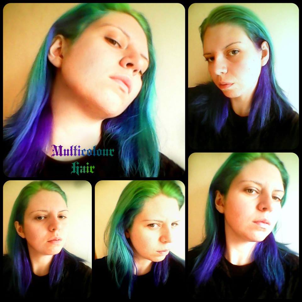
My hair is once again a mixture of cool-tone colours, but this time a slightly different selection. My friend Catastrophe Plague helped me with the dyeing.

Selfies taken on Raven's phone.

I started off with bleaching my regrowth and the under layers of my hair, which with my length of hair and how dark my natural hair colour is (dark cool-toned brown), means I have to bleach it in two sessions with several boxes of bleach. I left a lot of my hair jade-green, especially near the tips, as several years of bleaching my hair every few months mean it isn't as healthy as it could be (and the tips definitely need trimming as some are a bit fried) so I try not to over-bleach it if I can avoid it. If the gradient with the bleaching had been smoother, and if I felt that blonde suited me, I might have kept it with the green ombre effect, but alas I am so pale that blonde makes me look the wrong sort of ghostly.

That's not mould by the radiator, that's wallpaper remnants.

Catastrophe took the photo above, and Catastrophe was the one who dyed most of my hair. They separated my hair into horizontal layers, with a rat-tail comb and some hair-tyes, and then started sectioning the lower layer of hair, by the nape of my neck, into locks of about an inch of hair at a time, and tied each of those up with a hair-tie. Catastrophe then went systematically through my hair, dyeing each lock separately. Each lock of hair received its own blend of colours, with the lowest layer being mixtures of fuschia and purple, the next layer being violet and blue, the next layer being blue and turquoise and the top layer being turquoise and green. 

I left my make-up on... Oops.

I ended up sitting around a while with my hair in about 30 tiny pony-tails, all looped back on themselves, looking rather silly, and with dye all over my face, but it worked out really well in the end, and I think Catastrophe did an amazing job on my hair! This is my favourite multi-colour hair look so far, the colours are just the sorts that I love, and the 


Taken in the dimming light, but hopefully the colours show


Dyes Used
A variety of dyes got used, a few being left over from the last time I dyed my hair multiple colours. I have all the left over dyes stored in plastic clip-lid tubs for when I need to touch this up. The dyes used were:
Stargazer Magenta
Directions Violet
Directions Lagoon Blue
Stargazer Tropical Green
Directions Apple Green
Stargazer African Green
As you can probably tell from the results, the magenta was mostly mixed in with the violet, and the African green used quite sparingly this time. I really love the vibrant emerald green of the Directions Apple Green layered over both the very bleached and jade sections of my hair. 

For comparison, here are the previous times I have had multicolour hair:

This was the first time I dyed my hair multiple colours, even if it was just a variety of greens in a vertical gradient "ombre" effect. I only had this style temporarily as it wasn't work suitable, and I did it for Hallowe'en. I blogged about it ::here:: when I did it. I liked how it turned out, and was sad that I could not keep it in my hair. I think this was the first time I had a really luminous, vibrant lime green in my hair, too. I like the colour, but in retrospect I think that the cooler green tones suit me better than the warmer ones.

The next time I tried multicolour hair was last summer, when I did it for my friend's wedding - to match the colourful outfit I wore, which involved an emerald green dress and a violet jacket. I used quite a few more colours than I had before, and this was the first time I used blues and purples with green. I did my hair mostly on my own, with some assistance from Raven, and realised that hair this complicatedly coloured was really a two-person task. The purple did NOT stay in my hair well, and I used magenta over it for the first time to make it more vibrant. I blogged about that half-spectrum of colours ::here::.

This was the time after that... it had actually started fading in this set of selfies, but there was definitely more turquoise and blue than previous times. These pictures were tweaked slightly to counteract bad lighting, but give a pretty good example of what my hair was like. I did put purple in initially, but again, it washed out pretty rapidly. I have only had the latest dyes in one week, and I hope they last a bit better than before. I have learnt to use less shampoo with vibrant hair, as it is the shampoo that washes the colour out the fastest. Washing it without shampoo at all would just leave my hair greasy, so I have to use some, but I try to use it mostly near the scalp where my hair gets greasiest, and to not use too much. 


Saturday, 3 October 2015

Makeup Of The Day: Being batty!

Hallowe'en is coming! So I experimented with something a little bit kitsch and Hallowe'en-y.

As such, on Monday I decided it would be a good idea to draw bats on my face. I was right; bats ARE a good idea. I need MORE bats, in a greater variety of arrangements! I recently bought a selection of vinyl bat stickers for my study window, which I have arranged in a sweeping colony swirling around the edge of the glazing, and I figured that this sort of arrangement of bats would be good for curling down my cheekbone. 

Selfie by the HouseCat

I used greens and blues for the eye-shadow because that matches my hair. I was thinking of using purple for a more stereotypical Hallowe'en colour, but I think slime-green has become somewhat of a traditional Hallowe'en colour too now. Orange doesn't suit me, so it would never be orange. 


Also, these pictures are a somewhat edited, and not necessarily particularly well, because they were phone-cam selfies that turned out washed-out, faded and weirdly blue because I didn't adjust the white balance & exposure right. I tried to make the dark bits darker and the colours right, so that includes darkening up the makeup a little and putting the vibrancy back in my hair, but I know that on some monitors it looks like I have over-compensated and the pictures are too dark in places. As per usual, edited with ::PicMonkey::, which is a free online picture editor, and has a neat collage tool.

Wednesday, 2 September 2015

Wedding Belle

Outfit of the (wedding) day (of one of my friends)


During the recent mini-hiatus, I went to Wales to visit family and attend a friend's wedding. The bride (my friend) had recently experienced some tragic losses in her family, so I didn't want to wear black to her wedding because I felt it would be inappropriately funereal, and she had requested that I be bright and be myself. Well, as much as I am a Goth, I do like colours, so I decided to put together an outfit in green and purple - my two favourite colours. I went with brocades lovely fabrics of the sorts that I love, and in styles that would express the sorts of things that I like in terms of fashion, just in colours other than black. 


Photo by Raven, taken in an alcove at the museum next to Cardiff city hall. 

The jacket is one you will probably recognise; it is one of my fancier jackets and is from DarkStar. I've had it a while, and I wear it relatively frequently. The green dress was quite hard to track down! Initially I planned on wearing a dark green Lolita dress, but tracking one down that was both in my price-range and in my size proved too difficult to do by the wedding, so instead I went in search of a vintage style dress. There were some modern vintage-styled dresses that I liked, but then I suddenly found this dress; an actual vintage dress from Austria, by Madl of Salzburg. I adore the fabric it is made from, and it is a rich emerald green with a fabulous pattern. The sleeves are puffy at the shoulders, but not hugely puffy.  I bought it on eBay for approximately £25 including shipping, which I think is a bargain! The skirt is quite long, and I think would fit a petticoat, but I don't have any of the right style and length to go with this dress, nor did I want to wear one to an August wedding! The tights are (if I remember rightly) from Primark, and the shoes were also bought on eBay. I can't remember who made them though. Cat handbag is from H&M. Raven necklace is from Restyle, but that particular style has been discontinued after with an issue with their supplier over the metals used for the alloys. 

Sunday, 15 March 2015

Mermaid Make-Up

Today I experimented with colourful make-up. 
A very short post today!

I'm usually the sort of person that opts for very monochrome eye-makeup, but today I tried doing some make-up to match the colours in my hair. My hair is currently a darker gradient than before, with Directions Apple Green at the top, Stargazer Turquoise in the middle, and Directions Alpine Green for the back and bottom of my hair.

Not the best selfies. Photos by HouseCAT

For extra vibrant eyeshadow colours, I mask off under my eyes with bandage/dressing tape (being careful not to press too hard, otherwise it sticks fast and hurts a lot to pull off!) and then masking from the outer corners of my eyes to the outer ends of my eyebrows. I then cover the whole eyelid area right up to my brows in white foundation. The white foundation gives the eyeshadow something to stick to in order to last longer, and acts as a white ground to enhance vibrancy (something I learnt from Pre-Raphaelite painting techniques!). The masking using bandage/dressing tape also creates very clean, crisps edges. Really be careful not to stick it down too hard though, otherwise it really does tug at your skin to remove it (and as I have particularly stretchy skin, this is not fun!).

The finished effect reminded me of mermaids and ocean colours. Traditionally, mermaids are not always nice creatures, at least not in British mythology, where they're often a bad omen, or want to drown sailors - a bit like sirens - and are often associated with the weather turning nasty (this is Britain; the weather does that a lot, so perhaps we are overrun with mermaids? :P ). In Scottish mythology, there's a mermaid that's woman for the top section, and salmon for the bottom section, called a Ceasg or 
Maighdean Mhara that is a bit more benevolent, and she will grant three wishes to whomever catches her.

The photographs were taken on my webcam, and are not the best quality and are a bit hazy. They were also really quite dark despite it being a bright day, so I had to artificially lighten them in PicMonkey, so apologise if I look a bit paler than normal and a bit digital. The resolution wasn't good to begin with, and using tools that aren't meant as dodge and burn for those purposes in PicMonkey sort of smudged me further. 

Saturday, 25 October 2014

Gradient Green Hair

This time, on updating my green dye (it fades after a month or two, and the roots start to really show), I decided to do something different. 


I usually use a combination of Stargazer UV Green or African Green for the highlights and Stargazer UV Turquoise or Tropical Green for the lowlights, and thus get green hair with some dimension to it. This time, I decided to do something a lot more dramatic and give myself gradient hair. I've heard gradient hair called "ombre" but I'm pretty sure that only applies to where you've bleached the lower half of your hair and then maybe applied colour over that - a bit like how my hair dye goes after really growing it out! 


This was done by bleaching out my roots first. I hate trying to bleach my roots as they never quite bleach as pale as the neighbouring pre-bleached hair because it's almost impossible to not get bleach on the neighbouring sections, so the already-bleached hair becomes double-bleached, and the roots only once bleached, and then it still doesn't quite match... argh. I am generally not the best at bleaching my own hair. I have to bleach all my hair twice to get it from nearly black to blonde, too, so the second time I have to try and be extra-careful not to re-bleach what was bleached the previous time, because otherwise my hair will get all brittle at that point and is liable to snap, and while I quite like my hair short, an inch and a half long is shorter than I'm prepared to have right now. Sometimes this means I get a narrow stripe of slightly darker hair where I've strayed too far from the previously bleached hair and only double-bleached parts of my roots. If anyone knows how to make this an easier and less frustrating process, I'd LOVE the advice! 

(As long as the advice isn't "go to a hairdresser's salon" because I can't, due to aerosol allergies and cost issues.)

Once all my hair was as blonde as it was going to get, and I'd done my very best to not frazzle it, I started applying the dye. I love Stargazer because it's very cheap and very vibrant and stays quite vibrant for a while, and I used the UV Green for the top section. One of my friends suggested mixing conditioner in with my hair-dye to get softer hair and to help it after bleaching, so I did that, and combed a mixture of UV Green dye and conditioner down about four inches from my roots. The next section was a mixture of UV Green and UV Turquoise and conditioner, down another couple inches, and then UV Turquoise and conditioner for the rest down to the tips. Once I had washed out all the stargazer dye and conditioner, and dried my hair, I put another coat of UV Green over my roots for an extra vibrant neon green, and then got some Renbow Crazy Colour in Pine Green and rubbed it on the very tips of my hair. 


Of course, I can't have this for work, really. As I have had two weeks off from work on holiday, and this week coming is the Halloween week, and work are being quite permissive in the run up to Halloween (I work at a school, so they really get into the Halloween spirit for the children), it can stay until the weekend. After that, I am using up the remaining Pine Green and having dark green hair, but for now, I get to enjoy my fabulously bright gradient hair. At sunset, it literally glows in the UV twilight. 

Friday, 29 August 2014

Sin In Linen: Review

I GOT SNAZZY THINGS!
Look at this lovely pile of goodies I got sent! Forgot to include the tea-towel in this photo (oops).
::Sin In Linen:: are an online shop selling fabric home-ware products for the alternative market, and a while back their founder, Sandy Glaze contacted me via e-mail (best way of contacting me about Domesticated Goth related things!) about sending me a few things to review. After I saw they had Gothic kitchen items, especially oven-gloves, I readily agreed. I've previously bought a few Vigar funky cleaning and kitchen bits, but there's a very limited range of these sort of things in mainstream shops, and I just didn't think that there'd be anyone supplying this stuff specifically to the alternative demographic. I thought my flocked apron and spiderweb toilet paper were a sign that I was applying the Gothic aesthetic to more aspects of my life than many of us do (and possibly a bit more than I ought to!).

I only asked for a spider-web patterned oven-glove & pot-holder set, and they sent me not only that, but two tea-towels and vintage-tattoos patterned oven-glove & pot holder set! I always approve of extra free stuff.

I also asked them a bit about their business, and I've found out that it's run by an alternative lady looking to fill a niche that she noticed when looking for things for her own home. There's a short but informative ::article about her:: over at ::Women You Should Know:: 

The oven-gloves are mitten style, and are comfortable, fit even over my large paws (I'm a tall lady with long fingers) and Raven's talons - sometimes oven-gloves can be a bit small and seem designed for more petite people, seemingly ignoring that larger ladies and men also like to cook - no such problems here, though. The insulation is a bit on the thin side, and I felt my fingers getting warm pretty rapidly, but I decided to hold on to a hot baking tray (fresh out of an oven at 180°C) for 20 seconds to test this, and I didn't feel it get any hotter than warm. I've used it quite a bit since that first use, and on no occasion have my fingers been particularly hot. I haven't put a thermometer in them to figure out exactly how warm "warm" is, but I am pretty temperature sensitive, and it wasn't enough to bother me.  On the positive side, the thinner insulation makes it easier to actually take hold of things like ceramic dishes. Having two (even if they're unmatched) makes it easier to handle heavy and large things (like a roast chicken) - one thing I would suggest to Sin In Linen is the option to order matched pairs or connected oven mitts.


I like the print placement on the pot-holder.
The black looks actually black on the spider-web pattern, and I am always a fan of stereotypically Gothic things like the spiderweb print. I also really like the skull-and-crossbones print they offer. You can get the spiderweb oven-mitts ::here::. The practical aspects apply to both patterned mitts as the construction and fabric (rather than print) seem to be the same on both. I washed them with my regular black wash at approximately 40°C (older washing machines rarely stay at exactly the temperature of the setting) and there was no fade of colour.

[EDIT 29th Aug. '14: I have washed them a couple of times again since I wrote this and I've noticed that spiderweb print has started to fade and that the rolled hem of the edging on the pot-holder has started to come loose.] 

The two dish-towels I was sent were a vintage tattoo patterned one and and the 'Henna Tattoo' pattern one. You can get the 'Henna Tattoo' ones ::here:: and the vintage tattoo pattern one ::here::. They sell  dish towels by Sourpuss clothing with pictures done in the style of vintage tattoos too - I like ::this:: curvaceous tattooed mermaid!


This is after being washed and ironed; browns are all still rich and vivid!
I like the design of the 'Henna Tattoo' patterned one - it's a dark brown ink-and-wash design that is inspired by boteh ('Paisley' designs) and Mandalas and the colours of Henna art, and it is very pretty -  I have always enjoyed organic, foliate swirling designs - but the advertising blurb on the website seems to be overly exoticising various aspects of Asian culture and not properly referencing the inspiring cultures; Mandalas are from India, Tibet, and other Hindu and Buddhist groups in Central Asia, and Henna for body-paint in Mehndi designs is used in cultures from Sudan to Nepal.

I'm really happy with the actual dish-towels though! Sin In Linen have used nice fabric that almost seems too good in quality for use making dish-towels, although Raven found it a tad thin (probably because he tried to use it to hold hot things, rather than using the lovely oven mitts we were sent!). It's surprisingly good at wiping moisture off things for something that does not look readily absorbent. I am hoping that the patterns are colourfast in the long term as both patterns are very richly printed. I've washed them a couple of times with no apparent fading. I also like how they have a little loop attached to them to hang them up if you're the sort of person that has little hooks for their kitchen linen. 
Tattoo print. I like the mermaids best :) 
The tattoo print on both the tea-towel and the oven mitt is vibrant, clear and colourful. Raven likes red as kitchen colour, so the red trim around the fabric fits in well with out red kitchen items. I have not washed the tattoo print items, so I am not sure about how colour-fast they are yet. Unlike the spider-web design, the tattoo designs are not quilted. You can get the mitt set ::here:: and the towel from ::here::. There's a whole set available, with matching apron from ::here::, too. 

Many thanks to Sin In Linen for sending me free stuff. I hope people found this review detailed and interesting. If anyone has any further questions, please feel free to ask me in the comments. 

Monday, 28 July 2014

Vintage Inspired Gothic Makeup

I am calling this vintage inspired rather than vintage because it is not accurate to any one period and is very much of a mixture of '50s inspired vintage and Gothic elements.  

Raven recently bought me the Adare dress by HellBunny, which is an A-line skirted, sweet-heart neckline dress in a vintage-inspired cut reminiscent of '50s designs, but with a Gothic print and Gothic detailing in the ribbons up either side. I will do another blog post that is an outfit post for the dress;this is just about the make-up.

Doe-eyed selfie.
I was aiming for make-up that complemented the vintage theme of the dress and the outfit I was wearing, and that wasn't to overtly or traditionally Gothic, as the weather and the outfit were both quite summery, so I did not want to wear lots of heavy make-up. I opted for tinted primer, concealer and powder rather than thick foundation, and also wore sun-screen because it was bright out and I burn easily. I contoured my cheeks and used a little shimmer. Pale skin was fashionable in the '50s, so I didn't really have to do anything there!

I'd rather condense selfies into not too many images.
Whenever I think of '50s pictures of women, I think of that rich red lipstick. I was trying out a new lipstick I'd bought - 'Russet' by Miss Beauty London. It's a really rich, almost blood-red colour, and I think it makes a nice pop of dramatic colour without being too bright to be Gothic as I felt a rich, bloody red would be a bit suited. My lips were over-drawn slightly for that full, pouty Marilyn Monroe look.

The eye make-up is certainly more a nod to the Gothic than to vintage styles; from what I have seen of vintage make-up adverts, pin-ups and photographs, eye makeup tended to involve black mascara and winged eye-liner to create definition without being the dramatic centre of the look. I went for something heavier as one of the trademarks of Gothic make-up is dramatic eyes. I lined both lids heavily and went with the 'cat' winged looked, then made them smokey with a black blending into a rosy red; this was to complement the red of the lipstick. I used white on the inner corner and waterline to give a more doe-eyed look.

Very blurry feathers close-up.
None of my make-up designs are complete without me drawing something in eye-liner, and as there are feathers on the dress, I decided to draw a few feathers encircling one eye. Drawn designs are something of a trade-mark of mine, and the outfit certainly wouldn't have suited any of my elaborate scrolling foliage, so I drew some feathers, carefully placed to help define my cheek-bone. Certainly this is not very vintage, but it is very much me

One thing I feel I should have done but did not, is fill out my eyebrows more. I usually have eyebrows that are plucked to a thin line, and most vintage looks, especially those of the '50s, have fuller, defined eyelashes, and while I did pencil them slightly to darken them, I was unsure about successfully filling them out when there's so little of my natural eyebrows left. Also, I don't usually use blusher, so I think I may have ended up a bit heavy-handed on this look. A much more pastel pink would have probably been more suitable. 

This is quite the deviation from how I normally look, so I would appreciate constructive criticism (and links to tutorials I can follow, in order to improve.) 

Friday, 25 July 2014

Rait Castle & Barevan Graveyard: Raven's Photographs

Raven is photographer at ::Chance Photography:: and these are his photographs from the photography trip. 

✥ Rait Castle
Rait castle is located roughly two miles south of the town of Nairn, and about sixteen miles east of Inverness. A modest castle in my opinion, it could easily be mistaken for a derelict chapel or church.The castle is reported to be haunted, but this wasn't a ghost hunting trip, and it was far too bright a day to tempt out anything spooky!

The image above is a simple one, I liked how the shadow matched the line of the top of the wall. All I had to do was line up the shot and hope for the best.
I decided to keep the sky a slightly desaturated blue as I didn't want to detract from the detail in the walls, which came out really nicely with a slight tweak of the contrast.

HouseCat: I really like this photograph, for its balanced composition and very unusual angle. I don't think I've actually seen an intersecting walls photograph quite like what Raven has done above. This has got to be one of my favourite photographs by him. I need to persuade Raven to print one off for our walls!


Here we have a classic angle of the castle - simply google "Rait Castle", and you'll see what I mean. I am pleased with the way the colours came out on the walls, and the way the reds pop out against the greens of the foliage.


HouseCat: There are indeed about 10 photographs from a similar angle on the first page of Google Images - not something we actually looked at before out trip to Rait Castle! I think this is the most obvious angle from which to take the castle, partly because there is actually enough clear ground on that side of the castle to step back far enough to get the whole length of the castle in one shot, which there isn't on the other side. One thing that is interesting is how every photographer's image, even from very similar angles, has different results. Weather, and thus lighting, is certainly one factor, but each photographer has chosen a slight difference in distance from the castle, or angle to the castle; different cropping, different saturation. Raven and I went to the same place and chose completely different sections of the building, but even between photographers who chose the same things, there's a lot of difference. 


This one is one of my favourites... Simple but effective, in my opinion. I enjoy taking photos like this one. I think it is because of the way the light bleeds in, highlighting details that would be otherwise washed out if you used a flash, or if it was in broad daylight.

This is a macro of algae on the wall. Nice and simple again... The thing that drew me to the shot was the clear division between cold rock on the wall, and this lush green algae bursting its way in.

HouseCat: Raven has a very good eye for small details, things that most people would miss. The world is very interesting if you pay enough attention to spot the fur at the edge of the algae in a crevice of a wall!


Shots like the one above are what I like to call "grab shots". I saw the House Cat taking a photograph (using one of my lenses) so I took the opportunity using my telephoto, which proved effective by blurring out the background, and really making her stand out in the image.

This was me taking those photographs of the windows on the upper storey of the castle. Usually, when I am not actively modelling, I try and scurry out of photographs because I'm not really very photogenic without making the effort to be (I discard half of my selfies because I end up looking ungainly with a weird expression on my face!). I think he's managed to get a good composition for a photograph that was taken slyly as I concentrated on making adjustments. 

In summary, it is a lovely little castle, and I hope it stays protected for a long time to come. I found myself imagining what it would have been like in its day, and what kind of people walked it's hall.


✥ Barevan Graveyard & Chapel
This is a graveyard we drove past on our way to Rait castle, and we agreed that it would be a good idea to stop there on the way back... Which we did.

This is a very old grave yard indeed, and a rather pleasant one at that.I have always found grave yards to be quite cold, but this one seemed rather welcoming in an odd kind of way... almost as if it liked being visited from time to time.

Another two photographers were in our group - Suzy Bugs, who was taking only wildlife photographs, so is not taking part in Architectural Photography Week, and a Goth-y friend who goes by the screen-name Hemlock. Hemlock lives in the area and knows the countryside there pretty well, and it was he that pointed out the farm track to Rait castle (so we didn't have to park at the side of the road and hike the steep way up!) and also pointed out this graveyard.


Here is an image which really caught my eye... I don't think the photograph does what I saw justice to be honest. I found the way the light gently flowing through the trees onto the stone and foliage was quite eye catching.

HouseCat: I tried to take photographs of  chapel from this angle (not realising that Raven was too!), and I could not get anything as pretty as this; it's a testament to Raven's skill that he actually got something where the all the different layers and light levels in the image, from the brightness looking into the chapel through that window, to the details of the stones in the shade, are visible and nicely captured. 


Here is a simple photograph, which was initially intended to go in my texture library. It is a close up of a large stone sphere. I liked the way the structures of the rock are revealed through the polishing of the sphere, and through weathering over time. This is located in a smaller section, which belongs to the Cawdor family.


And here, we have the final image from my little set... The watchman. He can be found watching over the graves in a tree in the corner to the left of the gate as you come in.This character seems to get mixed reactions off different people. Some think it's creepy, having a face in a tree (which is totally natural, I might add!) but I, personally, found its smiling gaze to be rather endearing.

All in all, a great day was had by everyone involved, and it was nice to catch up with a couple of friends. I'll have to get back to Rait castle and do a shoot with a model or two at some stage, but anything like that is a way off yet!

Housecat: I volunteer to model, but Raven is probably sick of taking pictures of me! I hope you all enjoyed today's guest post by Raven. Hopefully Hemlock will be sharing his photographs from the trip tomorrow, and I will be back on Sunday to finish architecture week. 

Raven's photographs are NOT under the same "share if you properly attribute them to me and link back" rules as mine. I do not take photographs as a means to earn money, but he DOES, so please respect his work. If you want to share these photographs, share a link to the blog, rather than sharing the photographs themselves. Both of us will be every unhappy if we find our work being used commercially. This applies to all of his photographs on this blog, not just the ones here. 

Thursday, 24 July 2014

Barevan Church and Graveyard

In which I take even more photographs of windows...
After visiting Rait Castle, we headed to Wester Barevan, south of Achindown and Nairn, to visit the ruins of Barevan church, which has been ruined for a very long time, long enough for graves to have been lain in the floor of the old church. Barevan church and graveyard, in the summer sun, is one of the most peaceful and picturesque graveyards I have ever been to. It is almost like a garden, rather than a graveyard, and has plenty of pretty trees and nice views. 

A grave is lain where the altar once was... Eerie.
However, all it takes is a change of weather to give it an entirely different atmosphere. When the clouds roll in and obscure the sun, and when the wind rattles the leaves, it suddenly feels much more exposed. It is not quite as bleak as the wilder, open places of Scotland, as there are trees and it is circled by woodland and hills, but suddenly the weather seems very much there, and the stone walls seem greyer, and the lack of a roof suddenly becomes a concern. 

I heard you like windows, so here are two windows
seen through a window, viewed in a browser window,
perhaps on a computer running Windows...
The style of architecture, from the rough stone walls down to the Y-tracery on some of the double windows being carved from single pieces of sandstone, reminds me of Rait Castle, and I wonder if they were built at similar times or even perhaps by the same people, or whether that is just how things were done in that place in those times. As you may have noticed, I still have my obsession with photographing windows. 

Narrow depth of field, focusing on stone texture
I really enjoyed photographing the ruined church. I had some fun trying out new ideas with the photography, such as the photograph above. Normally at this point, I would be elaborating on the history of the architecture, but I really don't  know very much about the history of this graveyard - to me it is this is a totally unknown and unexpected graveyard in the middle of the countryside; I have no idea of why it is there, or what sort of congregation it would have had - there's not much settlement about it nowadays, but maybe more people lived there in the past. 

That one rock makes it seem more desolate than it is, by being less desolate.
I still think the strangest thing about that place is how quickly it changes with the weather, how rapidly it goes from almost serene to foreboding, how rapidly the clouds and wind can change how it feels. I will finish with two colour photos, taken within an hour of each other, which I think illustrate this point. 

This photo was taken a couple of steps away from the one above.
The clouds are dark and flat, what little blue is in the sky is quickly retreating and the walls are caught in shadow. Less than hour earlier I took quite a different photograph, looking in through the door of the church at a head-stone, and it seems so bright - like another time and another place, somewhere sunnier and with bright walls and green vines. 


Tomorrow I will showcase a guest post from Raven of ::Chance Photography:: with photographs from both Rait Castle and Barevan graveyard. Architecture week runs until Saturday, so stick around for more photographs!

Friday, 30 May 2014

Colour And Goth

There's a myth that all Goths are allowed to wear is black, maybe a little white or grey, but strictly a greyscale palette.
Green and purple; definitely two colours here!
This is completely untrue. Goths can wear colours.
I am sure that most experienced Goths know this, but I want to both reassure the younger and newer Goths, and dispel a common misconception.

Yes, black is the primary feature of our aesthetic just look at this blog layout!), but there's plenty of room for adding different colours into the mix. I do primarily wear black, but I personally love using accents of colour. I think all the black as a background means that I have to use stronger colours and designs to come forwards from such a strong but neutral background as black. I can thank Odile Decq, the French architect and designer, talking about her design for the Museum of Contemporary Art in Rome for making me think about this. Look her up on the internet; she is a fascinating and brilliant designer of multitudinous things from knives to buildings, and by appearances, I would guess a traditional style Goth, too! As such, when I wear colours with my black, it is in strong and bold designs, such as the dramatic eye make-up or the absolutely gorgeous purple and black "marching band" style jacket by Dark Star. I never go for mediocre or dull items - I go  for rich jewel tones and clothes with interesting designs. 

Hopefully the purple in my jacket is visible in this one.
I think contrast is the key to wearing colours with mostly black; to me it is far more striking if someone wears one or two bold colours with a mostly black outfit than if one wears equally dark or muted shades. Of course, layers of deep colours and darkness have their own appeal, too. I tend to wear usually only one colour with my black, usually dictated by my hair or wig colour. Combining two bold colours like in this outfit and make-up is actually quite an uncommon thing for me. I also like to match my accent colour so that I use the same shade throughout, as I feel that this co-ordinates and brings a sense of cohesion to the outfit. 
Grumpy Goth!
Actually, just trying not to smudge my lipstick.

Any colour can be worn with black, and I have no intentions of limiting anybody's fashion choices, but it is more traditionally Gothic to choose from purple (for magic and mystery) or red (for blood and passion). I have, however, seen pretty much every colour paired with black. To me each colour has its own association: blue brings associations of the night sky, neon green of the "radiation glow", emerald green of snakes and dragons, gold of Ancient Egypt, coppers and browns of Steampunk, pastel pink of the "creepy-cute" style, etc. It is rarer for colours to be worn without black, but I have seen some gorgeously Gothic (if not always necessarily Goth) outfits in almost completely red, white and purple - if there's any black at all, it is as an accent, and in some cases silver or white are used as the accent instead. It is not about the black, it is about the sort of aesthetic and associations portrayed. Silver and white on its own can look very ghostly, red on its own is good for portraying styles with links to vampires, carnal passions, and blood (with vampires being a combination of the latter two, in many ways). 

I am indeed wearing glitter with my Goth, too!
There are plenty of ways to combine colours into a Goth wardrobe and Gothic aesthetic. If you are looking for inspiration, just search the internet; there are plenty of beautifully styled Goths who often incorporate colours into their appearance without diminishing their "Gothness". Have fun, add some richness to the dark!